“Shh! It’s painting”
Mobile Application Design - Museum - 2024
This project was an assignment in the Mobile Application Design course. I had a set of specifications to follow, and therefore required pages:
- Basic public features;Select exhibition, rooms, tours, and works;
- Interactive map with a geolocation option;
- It is possible to sort and filter works;
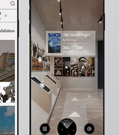
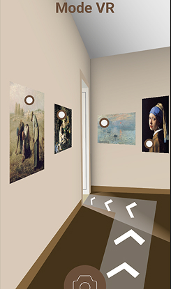
- Augmented Reality (AR mode) via your phone’s camera;
- Search for a work by name, number, or by scanning a QR code with your phone’s camera;
- When accessing a work’s page, the following information must be present:
- Name of the work, author, date, number, photos, description, and cross-browsing.
- History of works visited;
- Timer to track time spent on works;
- Connected features;
- Add a work to favorites;
- Write a personal note for a work;
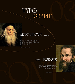
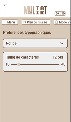
- Save typographic preferences;
- Accessibility options;
- High visibility mode (high contrast);
- Adjustable text size and style.
Obviously, the entire design had to be user-friendly, attractive, and ergonomic.
1 - Inspiration - Moodboard
To begin, I created a mood board to get the colors and fonts that match. I also looked for a UI kit to create consistency throughout the app. And finally, I looked for competing apps to see what main style to give my app and what I needed to respect.
2 - Creation - Prototype
Then, to get a general idea of the text that will be in the design and even the images, we make a prototype. This also allows us to make connections between the pages and see if everything is going as it should without having to change the entire design each time. This is the first basis of our application. Here, it was mainly to see how much information I needed to create and how much space it would take up. It also allows us to have the number of pages.
3 - Creation - Design
Next, we move on to the design of our application. We add the font, images, color, and everything needed to create an attractive and user-friendly design. Here, I wanted to create a calm and gentle atmosphere within the museum, which is why I used the beige color, so that when you arrive, you won’t feel overwhelmed. Then, I tried to use more “prestigious” fonts for the titles to be in keeping with the museum. The rest is determined by the chosen works and constraints.
4 - Creation - Animation
The final step is to animate our application, just like our prototype. This is where it will truly come to life. We’ll animate the buttons, images, navigation, and more. For this application, there are many animations for sorting, customization, and choosing rooms and exhibits. But also for the interactive map and virtual reality.